;fill-opacity:1;'/%3e%3c/svg%3e)
Brand Guidelines
Brand guidelines are the set of rules that define the overall look and feel of a brand, tone of voice and lots of other rules and elements. They include elements such as colors, logo variations, application rules, and typography.
These guidelines ensure that teams can express a brand consistently, whether through traditional marketing, printed media, or digital. However, as brands increasingly operate in digital environments — such as websites and apps — a brand book alone is no longer sufficient. This is where design systems come into play.
Design Systems
At first glance, a design system may seem similar to a brand book. However, it serves as a broader, interactive, and evolving guide that outlines how a brand is implemented across digital interfaces. It establishes standards for managing design at scale, minimizing redundancy, and fostering a shared language and visual consistency across various pages and channels. A design system represents a set of rules and reusable components that ensure everyone is aligned.
Design systems combine:
- Shared language between teams
- Clear design principles
- Visual standards
- Reusable code and design components
- Processes for contribution and maintenance
Here are some examples of design systems: Material Design, IBM Carbon and Atlassian's Design System.
What Makes Up a Design System
1. Foundations and Principles (Visual Style Guide)
They are basic visual rules and principles that serve as a guide on how a product should look, feel, and behave, rooted in the company's values and shared across teams.
They align design, development, and marketing efforts, especially when navigating conflicting ideas, keeping everyone on the same page with the same vision. They also offer guidance on content such as tone of voice and language recommendations. Well-crafted principles reflect brand personality, influence tone of voice, and shape user experiences—even in moments of error or support.
Foundations mostly include:
- Colors
- Typography
- Spacing & grid system
- Elevation (shadows, depth)
- Iconography
- Motion principles (if applicable)
Different design systems may have defined different foundations, but one essential thing we should be careful with is accessibility (a11y).
"For many people, technology makes things easier. For people with disabilities, technology makes things possible. Accessibility means developing content to be as accessible as possible, no matter an individual's physical and cognitive abilities and how they access the web." - From the article about Accessibility
Here's a brief digression. One of my former clients once told me—and this was during our work on designing a mobile app—that we shouldn't refer to our audience as "people with disabilities". Rather, it would be much better if we started saying that we're designing for people with special needs. That thing has stayed with me ever since; it changes the approach towards accessibility a bit.
Back to accessibility - shortly, it ensures that everyone can use your product, no matter the challenges they face at the moment. These challenges can be categorized based on their duration and context. Here are some examples:
- Permanent - Blind, deaf, non-speaking, dyslexic
- Temporary - Cataracts, arm injury, laryngitis
- Situational - Distracted driver, sleepy user
Color
Color is one of the first elements we define in a design system. It is often the aspect by which people remember a product, as it significantly influences our perception. This is why colors must be chosen thoughtfully. Just as selecting the right colors is important, organizing them effectively within the design system is equally crucial.
Use semantic naming for your colors, like "background-interactive-primary-default" to indicate their purpose rather than just their appearance.
Use the 60/30/10 rule, approximately 60% of the screen is neutral/background color, 30% of primary color, and 10% accent or CTA.
Regarding colors and accessibility, to follow the accessibility standards, always check the color contrast - the difference between foreground and background colors. Poor contrast can make content unreadable.
There are three standard contrast levels, defined based on the WCAG (Web Content Accessibility Guidelines) - the global standard for web accessibility:
- A - Minimum (Basic accessibility)
- AA - Mid-level (Contrast ratio of at least 4.5:1 for normal text (16px) - used in most cases)
- AAA - Highest (Contrast ratio of at least 7:1 for normal text. Best for maximum readability)
Typography
In general, typography is more powerful than most people realize. It communicates a brand's personality. In digital products, typography places a greater emphasis on readability. Since designs must be responsive, typography serves different purposes. It is essential to define a typography system to help maintain visual hierarchy, establish rules of application, and so on.
When designing for apps, consider display, title, and body fonts, each with large, medium, and small versions to handle layout variation.
Always choose a font by function or role first, then its size. Don't overload your scale with too many font sizes—this leads to inconsistency.
Ask yourself:
- How does letter spacing affect readability?
- How does weight affect hierarchy?
- What's the best line height for headers vs. body text?
Type scale
A type scale is a collection of various font sizes, building up from the base font size to larger sizes. It is a selection of sizes that are in harmony, achieved by defined scale factors such as the Golden Ratio (1.618) or the Perfect Fourth (1.333). The purpose of a type scale is to develop a collection of font sizes that are harmonious and can be applied consistently across the product.
When creating a type scale, it's a good idea to start with popular scale factors like the Major Third or the Perfect Fourth. You can also use plugins such as Typescale or Scaaale to simplify the process and speed things up.
Iconography
An icon system is a curated set of icons used consistently across a product. A well-designed icon system improves understanding and recognition across a product. It can include line, flat, 3D, or illustrative styles. Icons should be functional, recognizable at a glance (this is the reason why most icons look similar), tested with users to ensure clarity, and labeled with a clear naming structure.
Grids and Layouts
Grids, spacing, and layout provide the invisible structure behind every design. They make designs more consistent and easier to maintain when it comes to aligning elements and creating balance.
Here are a few key terms:
- Column - Vertical sections that organize content.
- Gutter - Space between columns that adds breathing room.
- Margin - Space around the edges that keeps content away from the sides.
There are different types of grids, each serving different purposes. The most commonly used in design is column grid, it is a structure that divides the layout into columns separated by gutters (you can see it on the previous image). Using a column grid helps designers align content and maintain visual balance. Designers usually use 12 columns for desktop or 2-4 columns for mobile. This type of grid provides the flexibility to design responsive layouts while keeping spacing and alignment consistent across components.
Spacing Systems
Spacing defines the visual breathing room between and around elements, including: padding, margins and whitespace.
Most spacing systems use multipliers of a baseline unit (like 8px). These are often documented as spacers in your system, even if they don't physically exist as components.
Designers can also define exceptions (e.g., using 4pt spacing in tight UI elements), but make sure these are documented and intentional.
Breakpoints
Breakpoints are crucial in defining grid changes for both fixed and hybrid grids. They establish fixed widths at certain breakpoints while introducing new dimensions at others.
Their purpose is to allow proper adjustments of layouts, typography, and elements, defining behaviors of those elements as screens get larger or smaller. They create order in which your design looks aligned and functions well, both on mobile and desktop screen sizes.
A design system might define breakpoints like:
- sm (mobile): 0-640px
- md (tablet): 641-1024px
- lg (desktop): 1025-1440px
- xl (large desktop): 1441px+
Elevation
Another aspect that can be defined in a design system is elevation, also known as shadows and effects. They are the key elements in design that add depth and focus to user interface (UI) elements.
As designers, we add shadows to elements by combining colors and adjusting transparency to make objects appear deeper or raised. We use blurs to create distance or to separate elements. They help users recognize interaction states, such as hover and focus, and provide visual hints.
As for other elements, the same applies to shadows—they need to be calculated and should have appropriate colors, not just black.
Shadows and blurs are important parts of design that add depth, texture, and focus to UI elements. They guide user attention and create a sense of order.
Atomic Design: A Modular Approach
Before we jump into the next key part of design systems - pattern libraries, we need to mention "Atomic Design" by Brad Frost, which uses chemistry as a metaphor to structure components. He explains the modular approach to components.
- Atoms: Basic UI elements (e.g., icon, input, button)
- Molecules: Groups of atoms (e.g., search bar)
- Organisms: Complex components made of atoms and molecules (e.g., navigation menu)
This method helps teams design in a modular way and build systems that scale. We'll touch on some key Atomic Design concepts throughout the rest of this post.
2. Design Tokens
Simply put, design tokens are the basic building blocks of a design system, usually expressed as variables or values. They are the smallest pieces of a design system — values for things like color, spacing, typography, and shadows, and other design attributes.
They are very important because they ensure consistency and allow global updates across the entire system (e.g., changing a primary color updates every instance). They help us use the same language, have more synced files, make maintenance easier, and build solid foundations.
Usually, we divide design tokens into 3 categories:
- Global (reference, global)
- Alias (semantic)
- Component
A hard-coded value (like #1B1B14 from the image above) is the most basic form of a design token — it's the literal, raw value used in design (e.g., a hex code for a color). It doesn't carry any semantic meaning (like "primary" or "background") and isn't reused through token names.
When creating design tokens, it is essential to follow a consistent naming convention that has been previously discussed within teams. This approach will help ensure clarity and uniformity throughout our design system. A good naming system makes it easier to find, understand, and apply elements across your product.
Naming conventions are essential to a design system's success, and they should be considered early in the process, but also maintained as part of the documentation, which we will cover later in the blog.
Why early naming matters:
- Prevents confusion later
- Establishes a shared language between designers and developers
- Minimizes miscommunication during handoffs and documentation
For example:
color-primary: #0055ff;represents a color from your palettefont-size-base: 16px;represents a typography rulespacing-md: 24px;represents your spacing system
Use semantic naming - don't just describe how something looks, describe what it does or how it's used. This makes naming more intuitive and supports better decision-making.
Naming conventions should also be clearly explained later in the design system documentation for various reasons, so that:
- New team members understand and follow the same structure
- Other team members know how to name new tokens or components
- Everyone can stay consistent when scaling the system
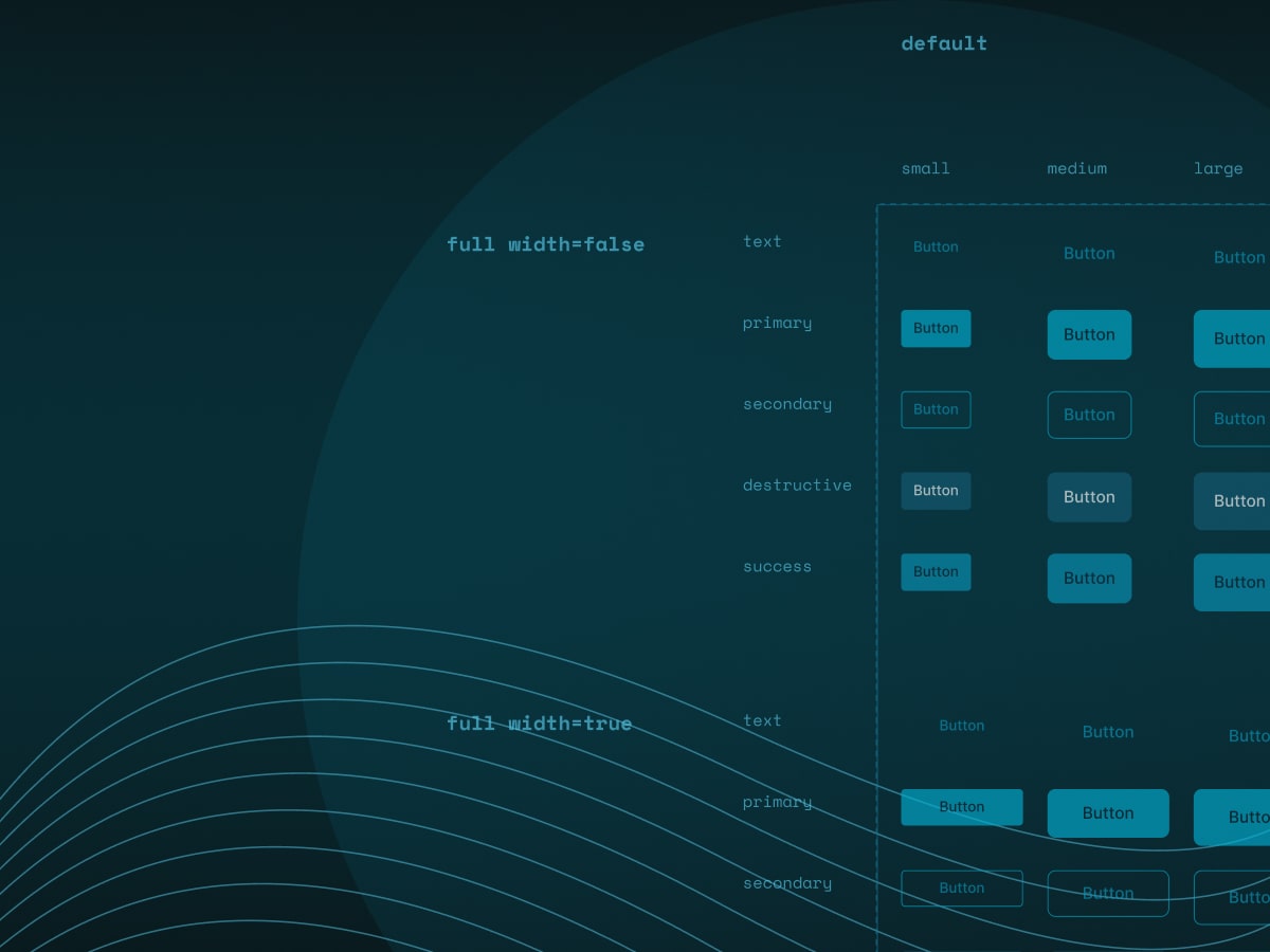
3. Pattern Library (UI Components)
Pattern libraries (also known as component libraries or UI components) are often what people think a design system is. They are collections of components—reusable UI elements—used by designers and developers. Creating these libraries requires significant time and resources, but the work pays off later on since it eases the development process.
Each component typically:
- Has a main component (also called the "master" in design tools)
- Has consistent interaction states between one or more instances (hover, focus, disabled)
- Follows your visual rules (color, typography, spacing)
Alongside visual representations, each component is documented with:
- Component Name
- Overview
- Properties
- Variants & States
- Implementation (Code)
Typical components are:
- Buttons
- Input fields
- Modals
- Navigation elements
- Cards, tables, badges, and more
It is always a good tip to define a clear naming system that makes it easy to find, understand, and apply components across your design system. Designers and developers should discuss naming conventions to choose a consistent format.
4. Documentation (Design System Guidelines)
Documentation defines and documents design principles, components, patterns, and guidelines.
Good documentation can include:
- Annotations in design files
- Component and style descriptions
- Naming conventions in a codebase or design library
- Written guides or internal articles
- Dedicated documentation websites
When writing documentation, it's important to consider how the necessary team members will access these resources. Since design systems can be complex, it's best to document everything as you go. Like the system itself, its documentation should evolve. Whenever a new component is added, the documentation should follow.
To organize design system documentation, think about the viewer's needs—like a team member looking for a definition of a specific component. Write simply - avoid slang, and use visuals to help explain your points.
Design systems also need to be maintained and may eventually be scaled. To successfully manage this, the team should have clear answers to questions such as: "How are updates made and shared?", "How are changes approved?", and "How do we onboard new team members?" It's best to define these rules before the system goes live.
A design system succeeds when designers and developers work side by side, so it is beneficial to involve developers early in critiques and align component structures with code. Understand platform limitations and be aware of how assets are built and function technically.
Do You Need a Design System
A design system can save time in designing and developing one product, but building a design system also takes a lot of time, resources, and effort. To know if you need a design system, ask yourself these questions:
- Are we developing or managing multiple products or features that belong to the same brand?
- Are designers and developers frequently duplicating the same UI components from scratch?
- Do we lack a unified source for our design choices?
- Is it unclear where to access the most recent design specifications or components?
If the answer is "yes" to most of these questions, you probably need one. But design systems are not for everyone. For small teams that work on small projects, a design system isn't always necessary. But if the team wants speed, consistency, and growth — especially across teams or platforms — a design system can be a good choice.
When a Design System Might Not Be the Right Fit:
- The team lacks the time or resources to build and maintain it, as it requires ongoing commitment.
- There is little need for reusable elements; some projects are unique or unlikely to expand.
- Team members do not agree on how to use the system, and training may take additional time.
- The organization views digital projects as fixed outputs rather than evolving products.
When a Design System Makes Sense:
- You want to improve the efficiency of the design and development team.
- The design team feels overwhelmed with repetitive tasks.
- A common design language is necessary for teams from different departments.
- You want to provide newer designers, writers, or developers with a valuable educational resource.
Why Design Systems Matter (Conclusion)
Design systems matter because they not only make products better, but they also align teams. Teams using design systems work faster and are more consistent in their work. Even a small system helps teams reduce repetitive design work. It gives designers the ability to reuse components instead of recreating them and developers the ability to translate them into code more efficiently.
Design systems are a source of truth for the product. They always have to be maintained, refined, and shared with intention. I like to use one quote that says: "Go slow to go fast." Taking the time to plan effectively leads to quicker and smoother progress in the long run, as does proper maintenance.
P.S. Advocate for Your Design System
A design system is only half the work; what matters is that the team adopts it over time. That's why it's crucial to share progress early, during the creation of the design system. As with everything else, collaboration is key — it's just as important for building and maintaining a design system.