;fill-opacity:1;'/%3e%3c/svg%3e)
In this blog post, we discussed visual design principles that might help you with your next project. We used examples of websites from the music industry.
User Experience Is Crucial for Any Product
User experience plays a crucial role in boosting user engagement and satisfaction. When users can interact with a product easily and without distractions, they are more likely to return to it in the future. This in turn leads to increased traffic, higher conversion rates, and improved overall user satisfaction. Additionally, the visual appeal of a product significantly influences how users perceive and interact with it.
Visual Design Principles Matter
Understanding design principles and how they work together is essential for both new and experienced designers. Carefully applying these principles in projects is key to creating design that is both visually appealing and highly functional. When designers understand the basic principles, they can begin to combine them, using them as a foundation when designing new products. Sometimes, designers may not even realize they are utilizing some of these principles yet they simply have an instinct for what looks right. Reflecting on them can help designers identify what may be missing when they feel stuck or have a creative block.
UX or UI: Which Matters More?
User Experience (UX) and User Interface (UI) are essential components that must work in harmony in order for software to truly stand out. UX and UI need to collaborate seamlessly because they are both equally important and cannot be separated. When a website or app feels intuitive and has an attractive design, it's a great indication that both UX and UI are successfully implemented.
We learned from the Forbes article (according to a Forrester study) that a well-designed user interface could raise your website's conversion rate by up to 200%, and a better UX design could yield conversion rates up to 400%.
Although this study suggest that UX takes the lead, it doesn't mean that we should underestimate the power of a strong UI.
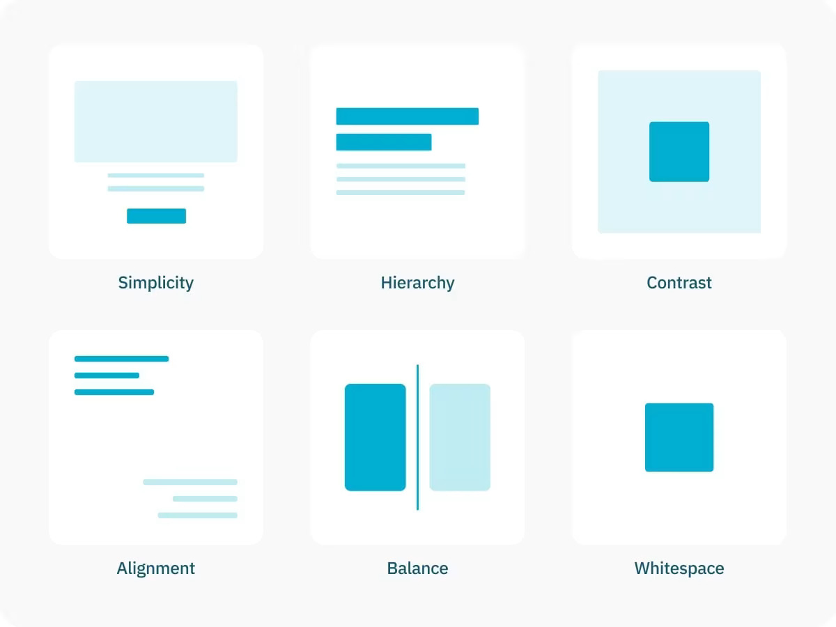
Simplicity
The first principle is simplicity. It is a principle that aims to eliminate unnecessary elements, making the product less complex. The goal of simplicity is to maintain a clean and uncluttered interface, which helps prevent users from feeling overwhelmed. By simplifying the design, we can minimize the cognitive load on users, allowing them to focus more easily on specific elements or tasks.
A great example of this is a minimalist homepage, where a straightforward interface guides users to a single action (or, in this case, two options), reducing distractions and enabling them to quickly make some action (Listen or Shop).
Hierarchy
Visual hierarchy is an essential principle that determines which content users will see first on the screen. It helps them understand the importance of information on a page, allowing them to scan the content with ease and prioritize the most important actions. One simple way to achieve hierarchy is through the use of bigger and smaller elements, such as headings and texts. The page heading, being the most important element, should be immediately recognizable. Headings, texts and any other element should be styled in a way that reflects their importance relative to one another.
In the example below, the visual hierarchy is established using the larger heading "Stones Tour '24," followed by the iconic image on the right. Below the title, there is a CTA (call to action) button for the main action. Below everything are the dots indicating that this screen is a slideshow. Since the dots are the smallest element on the screen, it makes them less important than anything else.
Contrast
A highly effective way to make elements stand out is by creating contrast, whether through size, shape, or color. Contrast highlights the differences between elements and is typically achieved by using two distinct colors or adjusting the size and proportions of the elements. It refers to the variations between elements in a design, especially those that are close together, which helps certain elements stand out.
By using colors that create strong contrast, we can better highlight focal points and direct the user's attention. A great example of effective contrast can be found on Springsteen's website, particularly in the section that lists upcoming shows. When users hover over a specific show the color changes and the background turns orange, emphasizing that section. This design allows users to easily identify which show they are hovering over and what action they may take next.
When we discuss contrast, the first aspect that comes to mind is the difference between text and its background. Overall, contrast is essential for accessibility. Insufficient contrast can make text hard to read, especially for individuals with visual impairments or those in challenging viewing conditions.
Alignment
Alignment is another essential principle that helps organize elements on a page by grouping them in a way that creates order and rhythm. Elements are typically aligned along invisible X or Y axes. The most common types of text alignment are left, centered, and right.
When used effectively, alignment can positively influence a user's perception of the elements on the page. If an element deviates from the established alignment, it disrupts the overall structure and stands out compared to other elements. This technique is known as "misalignment", and it allows the element to carry more visual weight.
In the example from Beyoncé's website, both left and right alignment are used, which may seem a bit unconventional, but the content remains legible. However, it could be more difficult to associate the numbers with the song titles on the right side, particularly when viewing the page on a larger screen. The visual separation created by this layout can make it harder for users to quickly connect each number to its corresponding song, affecting the overall clarity of the design.
Balance
Balance in design refers to how elements are arranged around an imaginary center line. There are two main types of balance: symmetrical and asymmetrical.
Symmetrical balance occurs when elements are evenly positioned on either side of the center line, creating a formal and stable appearance. On the other hand, asymmetrical balance involves arranging elements of different sizes, weights, or placements around a central line that does not have to be centered. This approach adds visual interest and energy to the design.
Every design element - whether it is typography, images, shapes, or patterns - has a visual weight. Some elements are heavier and draw more attention, while others are lighter. By thoughtfully arranging these elements, you can create a harmonious sense of balance in the overall design.
On the Coldplay page, we can imagine an X line running vertically down the center of the screen. The elements are evenly distributed on either side of this line. The blue illustration above the images adds an asymmetrical touch, but the overall layout still feels balanced. This sense of balance is achieved because the menu bar at the top is positioned slightly to the left of the imaginary X line.
White Space
Non-designers might think of white space as literally white space on the page, but it actually refers to the invisible space, or negative space, surrounding any element within the design. White space is a fundamental principle that enhances readability by allowing users to scan content and identify specific elements more quickly.
When used effectively, white space can create balance within a design. Achieving this balance involves using a consistent spacing system, utilizing increments of a consistent number. Another important factor is the proximity principle, which suggests applying less space around related elements and more space around unrelated ones.
A great example of effective whitespace usage can be seen on singer Billie Eilish's website. There is a consistent amount of space maintained between the titles and prices, as well as between the text and images. This combination of elements and whitespace forms cohesive groups, commonly referred to as "cards".
Conclusion
Enhancing both UX (User Experience) and UI (User Interface) designs is vital for software success. A visually appealing and user-friendly website or app shows that the interface and overall experience have been carefully designed.
There are many other principles, such as Gestalt Principles, Heuristic Evaluation, and others, but we believe that the few visual principles we've covered are helpful. Applying these principles can significantly improve user experience and assist users in achieving their goals. Following the rules is helpful, but it's okay to break them as long as the design still works well and gets the job done.