;fill-opacity:1;'/%3e%3c/svg%3e)
Have you ever wondered why some websites feel incredibly polished, with every animation flawless and every click or hover providing a "smooth" sense of responsiveness? That refined feel often comes from micro-interactions — tiny but powerful animations that give the user subtle yet important visual feedback. We will discover how, using SVG and CSS, you can introduce these small but key details into your projects, elevate the quality of the user experience to a new level, and at the same time maintain top-notch performance and code readability. Let's start by seeing how we can "polish" our interface and why these micro-animations are the secret behind polished websites.
What is SVG?
SVG (Scalable Vector Graphics) is a vector format for displaying two-dimensional graphics, with support for interactivity and animations.
This means that each shape in an SVG image is described mathematically (using points, lines, and curves), instead of as a set of colored pixels. For example, a circle is defined by its center and radius, and a rectangle by its position and dimensions within the coordinate system.
Due to this approach, SVG has several advantages:
- Infinite scalability – an SVG can be scaled to any size without losing image quality.
- Small file size: A vector image often takes up less space than a similar raster image, because an SVG does not store information about each individual pixel, but only the instructions for drawing shapes.
- Easy adaptation and styling: Because an SVG is essentially textual XML, it is easy to modify — we can edit the SVG code directly or style it via CSS and manipulate it with JavaScript, similar to HTML.
- Broad support: SVG is now well supported in all modern browsers (desktop and mobile) and can be used just as easily as other web image formats. Additionally, the structure of an SVG document is similar to HTML, so SVG content fits well into the modern frontend ecosystem.
SVG Coordinate System and viewBox
Given that each shape in SVG graphics is described mathematically, SVG uses its own coordinate system for positioning elements. This coordinate system is a bit different from what we're used to in mathematics. In a standard Cartesian system, we take the upper right quadrant as the positive direction of the axes (x to the right, y upward). However, in SVG (as in other computer graphics systems) the positive x-axis runs to the right, and the positive y-axis runs downward.
SVG provides an infinite "canvas" in all directions — theoretically, you can draw content anywhere in the coordinate system. Of course, you don't want to display infinite space, which is why SVG introduces the concept of a viewBox. The viewBox determines which rectangular slice of that infinite coordinate system will be visible within the SVG element (similar to how we only display a portion of an infinite mathematical coordinate system when drawing on a board). In other words, the viewBox defines which part of the SVG "canvas" (coordinate system) is visible in the given window/view. For example, if we set the attribute viewBox="0 0 100 100", it means our view covers the coordinate space from point (0,0) to point (100,100) — everything inside that area will be visible, and everything outside it will be cut off. The viewport of the SVG element (as well as the specified width/height in HTML or CSS) will determine the size at which that viewBox is displayed on the screen, meaning the content may be scaled. Thus, for instance, an SVG tag <svg width="200" height="200" viewBox="0 0 100 100"> sets a visible area of 100x100 coordinate units, which will occupy 200x200 pixels on the screen — the content will be magnified 2 times because we are displaying 100 coordinate units in 200px of space.
Once we've defined our "canvas" (the viewBox), we can start drawing elements.
Note: When writing SVG as a separate .svg file (or inline in HTML), we need to add the attribute xmlns="http://www.w3.org/2000/svg" at the beginning of the <svg> element (so that the browser correctly interprets the elements as SVG and not as plain HTML/XML).
For example, if within an SVG with a viewBox of 0 0 100 100 we draw:
<svg viewBox="0 0 100 100" xmlns="http://www.w3.org/2000/svg">
  <rect width="50" height="50" />
</svg>
we will get a 50x50 rectangle placed in the top-left corner (since we didn't provide different x and y attributes, they default to 0). By default, the rectangle will be filled with black because we did not specify a fill attribute.
Of course, SVG also supports other basic shapes — we can draw circles, ellipses, lines, polygons, etc., using the corresponding elements (<circle>, <ellipse>, <line>, <polygon>, <polyline>, etc.).
Although basic shapes might seem limited, with a bit of imagination and skill you can achieve impressive results using only them.
<path> – the king of SVG elements
The most powerful and versatile drawing element in SVG is the <path>. While the above-mentioned "basic" shapes have specific roles (rectangle, circle, etc.), the <path> element can draw virtually any shape — straight lines, curves, arcs, and even entire complex shapes. In fact, every other SVG shape can be represented via an equivalent path.
Because of this flexibility, <path> is key for drawing more complex shapes and illustrations. At the same time, its syntax (a string of letters and numbers inside the d attribute) looks intimidating at first glance.
Basic path drawing commands
A path is defined by a series of commands (denoted by letters) and their associated numeric parameters (coordinates, lengths, etc.). Each letter represents an "instruction" to the SVG shape drawer, and the numbers that follow determine the parameters for that instruction. Here are the most important commands and what they mean:
- M (Move To) – moves the "pen" to the given point without drawing a line. After a
M x,ycommand, the next drawing will start from the coordinate (x, y). For example,M 10,20sets the starting point to (10,20). There is also a lowercase variantmthat does the same thing but relative to the current position (e.g.,m 5,0moves the current position 5 units to the right). Uppercase letters always denote absolute coordinates within the SVG's coordinate system, while lowercase letters denote relative moves from the last point. Every path typically begins with at least one M to define the starting point of the drawing. - L (Line To) – draws a straight line from the current point to a new specified point. The command
L x,ywill draw a line from the current position to the absolute coordinate (x,y). There is also a relative variantl. Besides L, we have shorthand versions for horizontal and vertical lines: H/h (horizontal line) and V/v (vertical line). - Z (Close Path) – closes the current path by drawing a straight line from the current point back to the starting point of that path, i.e., back to the M/m that opened that subpath (which is not necessarily the first M/m in the entire command sequence). This command is typically used at the end of a shape definition to close the contour. It has no parameters, and the lowercase and uppercase versions (z or Z) do the exact same thing. Closing a path ensures that the shape is treated as a closed figure (which is important if it is being filled with color).
- C (Cubic Bézier Curve), Q (Quadratic Bézier Curve), A (Arc) – a more complex topic, but the key is to understand that Bézier curves (Q and C) use control points that "pull" an imaginary straight line between the start and end, bending it into a curved path. The Arc command, on the other hand, uses a segment of an ellipse to draw smooth rounded arcs.
I recommend this super handy CodePen as a tool for understanding Bézier curves. The example demonstrates interactive dragging of a Bézier curve's control points.
By combining all these commands, <path> gives us "free rein" to draw virtually anything.
SVG as a React component
Another interesting thing about SVG is that an inline SVG can be a React component. In other words, within React JSX code we can directly return an <svg> element as part of a component's render:
function MyLogo() {
  return (
    <svg width="100" height="100" viewBox="0 0 100 100">
      {/* ... */}
    </svg>
  );
}
Note: In React's JSX syntax, it's not necessary to manually specify the xmlns="http://www.w3.org/2000/svg" attribute — React automatically creates the SVG element with the correct namespace.
This approach opens the door to numerous possibilities. SVG behaves like a DOM element, which means we can style it with CSS and manipulate it through a component's JavaScript logic. Compared to classic HTML/CSS, where creating irregular shapes (e.g., some complex illustration or animation) often requires various hacks or the <canvas> element, embedding SVG as a component provides a more elegant solution.
Why is this important? Because modern frontend frameworks (React, Vue, Angular, etc.) are based on a component approach – an application is built from smaller, self-contained pieces (components) that encapsulate their own state and logic. SVG fits into that approach just as naturally as any <div>: we can split one more complex SVG into multiple smaller components, where each component represents a part of the graphic (for example, one layer or shape within the SVG) with its own local state and logic. This results in cleaner, more modular code and makes it easier to manage complexity. For instance, we might have a component that represents an icon with an animation, which we then use throughout the application wherever needed. The local state of that component can control the SVG's animation (stop it, start it on hover, change its color depending on the theme, etc.), and the rest of the application doesn't need to know the implementation details — just like with any other React component.
In short, inline SVG + React = a combination of irregular shapes and the power of components. We get the best of both worlds: design freedom (thanks to SVG) and structured, reusable code (thanks to the component approach).
Animating SVG
SVG elements have their own mechanisms for animation (SMIL animations within SVG, defined by <animate> elements).
A bit of history about SMIL – around 2015, Google planned to deprecate and remove SMIL from Chrome, advocating a transition to CSS animations and the Web Animations API as unified solutions for SVG and HTML animations. At that time, SMIL support was inconsistent and development of the SMIL specification had stagnated. Although Chrome even briefly started showing console warnings for SMIL, community feedback delayed its removal – the Chromium team ultimately did not remove SMIL and it is still around. Nevertheless, because of that announcement and the fact that SMIL didn't work in IE, many tutorials and articles advised using CSS animations or JavaScript instead so that animations would work everywhere.
Today, with full support, SMIL is still a valid option for SVG animations, especially inside standalone SVG files or icons. The advantages of SMIL are that it's declarative (the animation is defined in the SVG markup, not in CSS/JS), it can animate attributes that CSS cannot, and it works even when an SVG is used as an <img> or background-image (where CSS animations couldn't affect the image's content).
However, SMIL is somewhat a "forgotten" technology – knowledge and community support for SMIL is not as widespread. The recommendation to use CSS or JS is often driven by developer experience and long-term maintainability. Development of SMIL (SVG Animations Level 2) is practically not active, whereas CSS and WAAPI are actively evolving. Google's intent to replace it with other technologies hasn't been forgotten, so some cautiously wonder if SMIL might one day be removed (for now there are no indications of that and support remains).
In that sense, the recommendation for CSS/JS alternatives remains relevant, but not because of browser support (which is good), but more due to the aforementioned practical reasons — except when you need to animate attributes that CSS doesn't support, for which SMIL is still a handy option.
As for CSS animations – similar to HTML elements, not all properties can be animated, only those that support it (e.g., position, size, fill color, opacity, etc.).
The combination of SVG and CSS animations is especially suitable for simpler animations. For such cases, we often don't need heavy or complex tools — just a few lines of CSS applied to SVG elements are enough. The performance of these solutions is excellent, because the browser animates vector shapes directly (which are often highly optimized for property changes), avoiding the need for constant raster re-rendering. As a rule, animating vector properties (like path data, stroke length, transformations) with CSS is unparalleled in performance for simple effects.
To illustrate how powerful SVG can be in animations, we can look at some modern CSS capabilities that are actually borrowed from the world of SVG. An example is the CSS Motion Path module – it introduces the offset-path property, which allows us to "place" an HTML element on a path that it will follow. This path is defined using SVG path syntax. For example, instead of a classic translate animation along the X and Y axes, we can specify:
.element {
  offset-path: path("M0,0 C50,100 150,100 200,0"); /* example path */
  animation: move 5s infinite;
}

@keyframes move {
  to {
    offset-distance: 100%;
  }
}
In the example above, the .element will move along the specified curve, instead of straight along the x or y axis. The offset-distance property determines the position of the element along the path in percentages (0% is the start, 100% is the end of the path).
This is a relatively new addition to the CSS specification (the so-called CSS Motion Path Module), and full browser support only arrived around 2020. Today offset-path is widely supported and we can use it for very interesting animations — for example, animating an object moving along a winding path, or text following a curved trajectory, and similar effects — all without a single line of JavaScript code, using a pure SVG path within CSS.
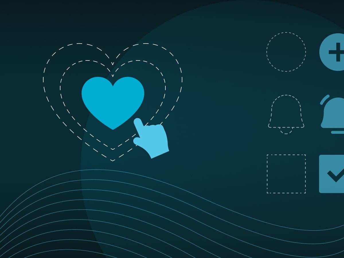
Micro-interactions
All these animation capabilities bring us to the concept of micro-interactions. Micro-interactions are small animations or changes in the interface that trigger when a user performs some action — clicks a button, toggles a switch, enters correct data into a form, or loads a page.
They are so small that they often go almost unnoticed, yet micro-interactions make an enormous difference in the user experience of an application.
They provide the user with feedback and a sense that their actions have been noted: for example, a button may bounce or change shade when pressed (signaling that the click was registered), a switch slides smoothly with a slight ease-out effect when toggled (showing that the state change was successful), or a small loading spinner appears after submitting a form (letting the user know something is happening in the background).
Well-designed micro-interactions can also guide the user through a process — for instance, an icon or field border turns green and gently pulses when a form field is correctly filled out, providing a visual signal to the user that they can move on to the next field.
The best micro-interactions are discreet, simple, and consistent with the application's design/brand. They are subtle enough not to distract the user from accomplishing a task, yet expressive enough to bring a sense of fluidity and "life" to the interface.
Those small, subtle animations blend with the application's functionality in a way that increases the feeling of satisfaction — a user might not explicitly notice why something feels "nice" or "pleasant" to use, but it is precisely the sum of those details that makes the interface feel responsive and thoughtfully designed.
Branded micro-interactions
Branded micro-interactions raise the stakes — they take those small animated moments and align them with the application's brand personality. Instead of generic effects (like the usual gray pulsing or the standard bouncing ball animation), every color, shape, and motion of a micro-interaction can "speak the language of your brand". This means that through those animations, you further convey the identity and values of your company or product.
For example, imagine an application whose brand is characterized by bright orange tones and a playful mascot. Instead of a plain animation, the order confirmation button could have a subtle bounce effect in the brand's signature orange color after being clicked, perhaps even with a brief shine across the text or icon that highlights the logo. At the same time, the loading icon isn't a generic spinner — it might use a stylized shape of the brand's mascot that spins or walks in place, signaling that the app is working on the request. Such micro-interactions are still small enough not to draw attention away or interfere with usage, but at the same time they strengthen the emotional connection with the user. Each time the user clicks or moves something, the interface subtly communicates: you are still in our world. Branded micro-interactions create a distinctive experience with every click, hover, or scroll. They make the interface unique and memorable, because the user remembers those little signature moves that set your application apart from impersonal, generic systems. Ultimately, this builds user loyalty — over time, people come to love those very details that make the application feel "alive" and in the spirit of the brand.
In short, micro-interactions tailored to the brand's identity are a fantastic playground for using SVG+CSS animations! SVG allows for the creation of unique shapes and animations that follow the brand (without being limited to rectangles and standard web elements), and CSS ensures those animations are smooth and performance-optimized.
Examples
Below we present two examples in which we employed somewhat extravagant effects to highlight the capabilities of SVG:
Hover effect on the "Contact" button
When the user hovers over the contact button on our page, a small SVG + CSS show begins. On hover, our wizard's staff (a motif from the CodeMage logo) swoops toward the button and "ignites" it. In doing so, we discreetly encourage the user to click and reach out — creating a bit of magic.
In the page header our logo is an SVG, and here we are interested in the part of the logo that draws the wizard's staff:
<svg viewBox="0 0 123 33" fill="none" className={style.logo}>
  <g>
    ...
    <g className={`${style.staff} ${isActive ? style.active : ""}`>
      <path
        d="M116.766 11.1627L112.975 7.49798L114.07 2.99079L119.041 1.85346L123.211 4.25449L119.715 -0.168457L114.323 0.589762L111.922 1.60072L110.869 4.086L110.069 5.22332L109.984 8.08771L112.048 9.85689L114.997 13.0583C115.629 13.2267 117.609 13.8165 118.198 14.0271L116.766 11.1627Z"
        fill="white"
      />
      <path
        d="M111.544 31.6768V31.8875L108.679 32.0138C108.679 31.9717 108.637 31.9296 108.637 31.8875C108.427 31.4241 108.258 30.9608 108.174 30.708C108.005 30.2025 111.502 27.1275 111.502 27.1275L112.007 24.0947L111.333 21.6094L113.102 19.8402L113.018 16.9758L112.26 14.4484L114.577 12.7214V12.6371L114.619 11.8789C115.461 12.2159 116.683 13.3111 117.525 13.6481L117.609 13.8587L118.199 14.0693L116.219 15.3751L115.756 17.3971L116.599 20.0087L114.24 24.3053L114.324 28.1806L111.965 30.034L111.544 31.6768Z"
        fill="white"
      />
      <path
        d="M120.871 7.0704L118.363 3.68579L114.979 6.19339L117.486 9.578L120.871 7.0704Z"
        fill="#00AED1"
      />
    </g>
  </g>
</svg>
We use the aforementioned offset-path with which, once we have defined the path, we can very easily "fly over" from the start to the end of the given path using the offset-distance property.
.staff {
  transition: offset-distance 3s ease-out, opacity 500ms 3s ease-in;
  offset-rotate: 0deg;
  offset-anchor: 100% 100%;
  offset-path: path(
    "m 123 33 h 1 q 40 -1 70 40 c 190 300 -150 -20 110 150 q 92 66 128 56"
  );
}

.active {
  offset-distance: 100%;
  opacity: 0;
}
The button itself is actually an SVG, which allows us to achieve effects that aren't possible with just HTML and CSS alone.
<button
  className={`${isActive ? style.active : ""}`}
  onMouseEnter={setActive}
>
  <svg
    viewBox="0 0 120 40"
    width={120}
    height={40}
    overflow="visible"
  >
    <path
      d="M 0 31 L 0 0 h 120 v 40 h -120 z"
      fill="white"
    />
    <path
      d="M 0 31 L 0 0 h 120 v 40 h -120 z"
      fill="white"
      stroke="#00AED1"
      strokeWidth={3}
      className={style.strokeElement}
    />
    <text
      fill="black"
      fontSize={16}
      x="50%"
      y="50%"
      textAnchor="middle"
      dominantBaseline="middle"
      fontWeight={600}
    >Contact us</text>
    <text
      fill="transparent"
      fontSize={16}
      x="50%"
      y="50%"
      textAnchor="middle"
      dominantBaseline="middle"
      fontWeight={600}
      className={style.textFilterElement}
    >Contact us</text>
    <defs>
      ...
  </svg>
</button>
stroke-dasharray is a CSS property often used for animating the drawing of shapes (for example, a signature writing effect). Its behavior is controlled by the stroke-dashoffset property, similar to how we earlier used offset-distance to control the animation of offset-path.
.strokeElement {
  stroke-dasharray: 320;
  stroke-dashoffset: 320;
  transition: stroke-dashoffset 1000ms 3s ease-out;
  stroke-linecap: round;
}

text {
  transition: fill 500ms 3000ms ease-in;
}

.textFilterElement {
  opacity: 0;
  filter: url(#glow2);
  transition: opacity 300ms 3500ms ease-in;
}

svg {
  transition: transform 300ms 3500ms ease-in;
}

.active {
  path {
    fill: transparent;
  }

  .strokeElement {
    filter: url(#glow);
    stroke-dashoffset: 0;
  }

  text {
    fill: white;
  }

  .textFilterElement {
    opacity: 1;
  }

  svg {
    transform: scale(1.1);
  }
}
Animation through the contact form
As the user fills out the fields in the form, our magic gradually intensifies. With each completed field, the wizard's staff glows stronger — from faint "magical particles" to a strong sparkle in the final field. At the end, when the user presses the submit button, we send off "the magic", enhancing the sense of a personalized, branded experience.
Here the situation is a bit more complex, so we use the benefits of SVG and the component approach to separate the magic orb into a standalone component. This component sets up the SVG and generates a certain number of "tentacles" depending on the completeness of the contact form.
return (
  …
    <svg
      viewBox="0 0 400 400"
      preserveAspectRatio="xMidYMid meet"
      className="w-full h-full"
      onClick={send}
    >
      <defs>
        …
      </defs>
      {totalTentacles &&
        new Array(totalTentacles)
          .fill(0)
          .map((_, index) => (
            <Tentacle
              key={index}
              index={index}
              percent={percent}
              clicked={isClicked}
            />
          ))}
    </svg>
    </div>
  </div>
);
The orb itself is subtly animated with simple CSS animations.
@keyframes floatting {
  0%,
  100% {
    transform: translate3d(0, -5px, 0);
  }
  50% {
    transform: translate3d(0, 5px, 0);
  }
}

@keyframes flickr {
  0%,
  100% {
    opacity: 1;
    transform: translate3d(-5px, 0px, 0);
  }
  25%,
  75% {
    opacity: 1;
  }
  50% {
    opacity: 0.5;
    transform: translate3d(5px, 0px, 0);
  }
}
The tentacles are composed of a path element with circular shapes "pulsing" along them.
const Tentacle: ... = ({ index, percent, clicked }) => {
  …

  return (
    ...
      <path
        d={[
          `M200,200`,
          `C${c1.x},${c1.y}`,
          `${c2.x},${c2.y}`,
          `${end.x},${end.y}`,
        ].join(" ")}
        stroke="#00AED1"
        strokeOpacity={0.4}
        strokeWidth={1.5}
        fill="none"
        filter="url(#glow)"
        className={clicked ? style.clickedBasicPath : style.unclickedBasicPath}
        pathLength="100"
        strokeDasharray="100 100"
        style={{ transition: "stroke-dashoffset 600ms ease-out" }}
      />
      {index < Math.floor((100 * percent) / 100) && (
        <g
          className={`${style.circle} ${
            clicked ? style.clicked : style.unclicked
          }`}
          style={{
            offsetPath: `path("M200,200 C${c1.x},${c1.y} ${c2.x},${c2.y} ${end.x},${end.y}")`,
          }}
          fill="#00AED1"
        >
          <ellipse ry={5} rx={16} cx={200} cy={200} opacity={0.1} />
          <ellipse ry={4} rx={12} cx={200} cy={200} opacity={0.2} />
          <ellipse ry={2} rx={8} cx={200} cy={200} opacity={0.3} />
        </g>
      )}
    ...
  );
};
For the described effects we use the properties we already got to know — the powerful and versatile stroke-dasharray and offset-path.
.clickedBasicPath {
  stroke-dashoffset: 100;
}

.circle {
  offset-anchor: 50% 50%;
  transition: opacity 600ms ease-in;

  &.clicked {
    opacity: 0;
  }

  &.unclicked {
    animation: vibe 5s linear infinite;
  }
}

@keyframes vibe {
  0%,
  100% {
    offset-distance: 0%;
  }
  50% {
    offset-distance: 100%;
  }
}
Conclusion
The entire code is available at our GitHub.
Note: The examples, for the sake of conciseness and focus on SVG + CSS, are tailored for desktop resolutions only.
In conclusion, SVG+CSS animations provide an outstanding platform for designing micro-interactions that are small in scope but big in impact. They are technically interesting to implement, and they give users that subtle feeling of satisfaction which differentiates a superbly designed application from an average one.
Thanks: I extend my thanks to numerous CodePen examples that served as inspiration for the ideas shown here. I recommend CodePen as an excellent resource for exploration – you can find many creative examples of SVG animations and micro-interactions that demonstrate all that is possible to achieve with the combination of SVG and CSS in the modern web.